Brazilian Wabi ⏤ Inside Peclat+Chow’s Santos Apartment
Forget about typical Brazilian interiors or tropical references when entering Peclat+Chow’s Santos apartment, in São Paulo. Yet do not imagine cold, sterile minimalism either: rough materials, true to themselves, and a warm feeling, not brought by bright, bold colors and textures, but through tactile experiences and a coherent subtle mix of modern and contemporary. Brazilian design has always been able to dialogue with international references and to create its own perspectives and uniqueness - in this case, with a slightly peculiar touch.
Drawn by textural inspirations and by how light and shadow behave on a material or a surface, the duo uses references from their view on city-life, art, and design, rather than from architecture only. Through the design process, they rethink these inspirations and translate them into a new, original, and more complex identity, avoiding any trivial aestheticism.
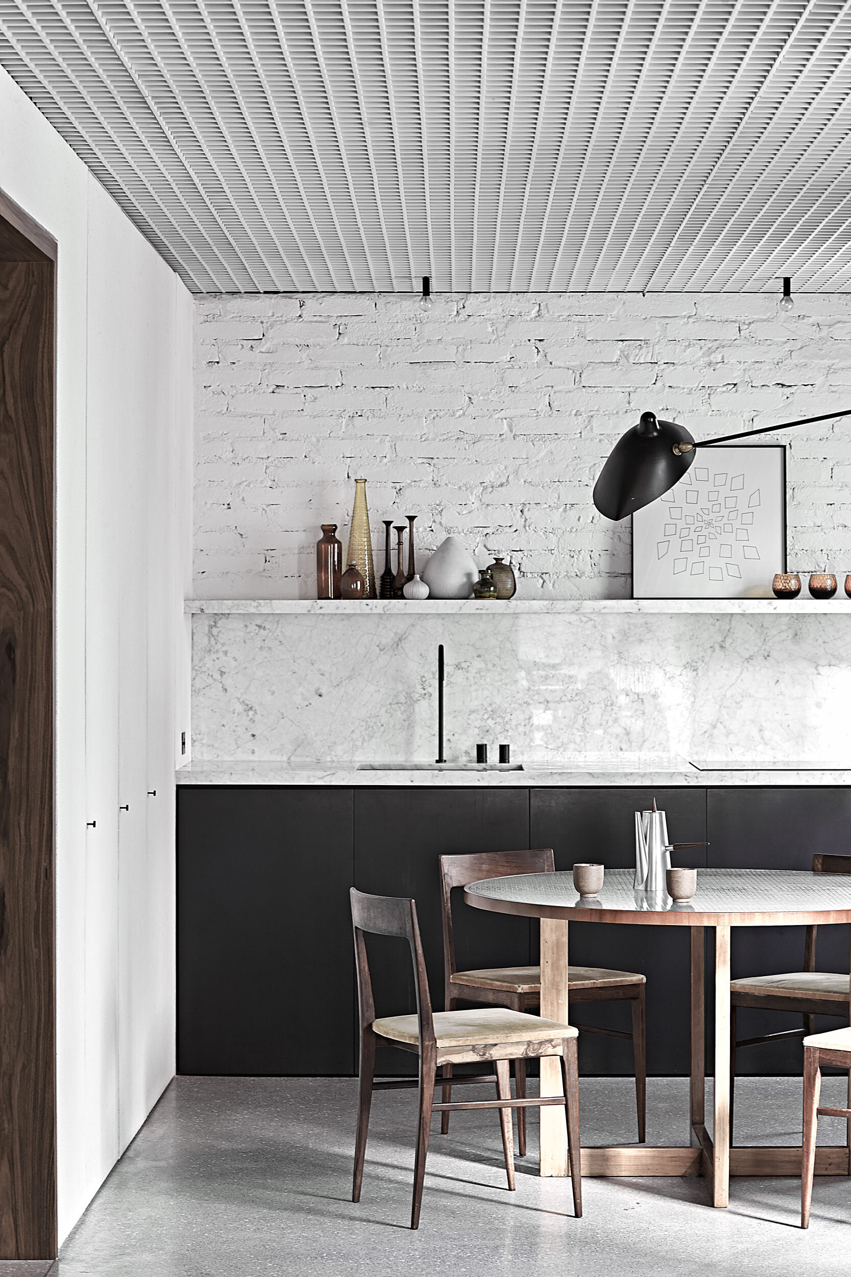
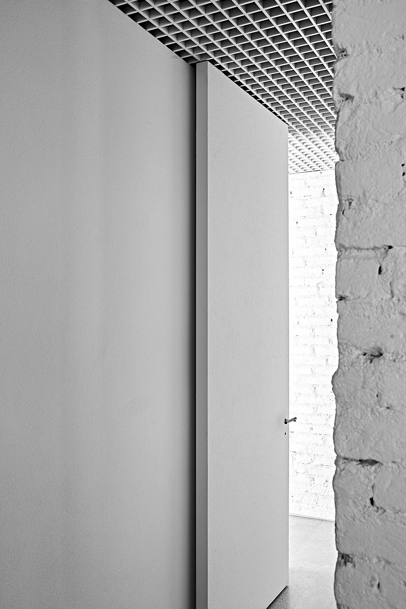
The terrazzo floor, widely used in Brazil during modernism, with its opaque surface and subtle non-homogeneity, intersects with exposed white-painted brick walls and textured panels hiding the storage areas and doors. The wooden entrance tunnel, which intends to guide those who enter from the dark hallway to the bright and clean living spaces of the apartment, is an apparent and potentially unique concession to Brazilian contemporaneity.
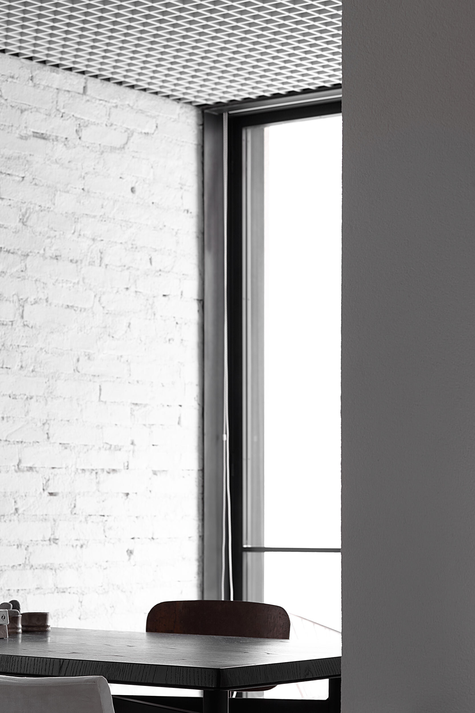
Simplicity is not to be confused with a lack of thought or personalization, though. Many features catch the eye, starting from the bespoke door handles, switches, faucets, and even windows, entirely designed by the architects and produced locally. The curation of materials is very limited to reinforce both the cohesive identity and the fact that no detail was left unchecked.
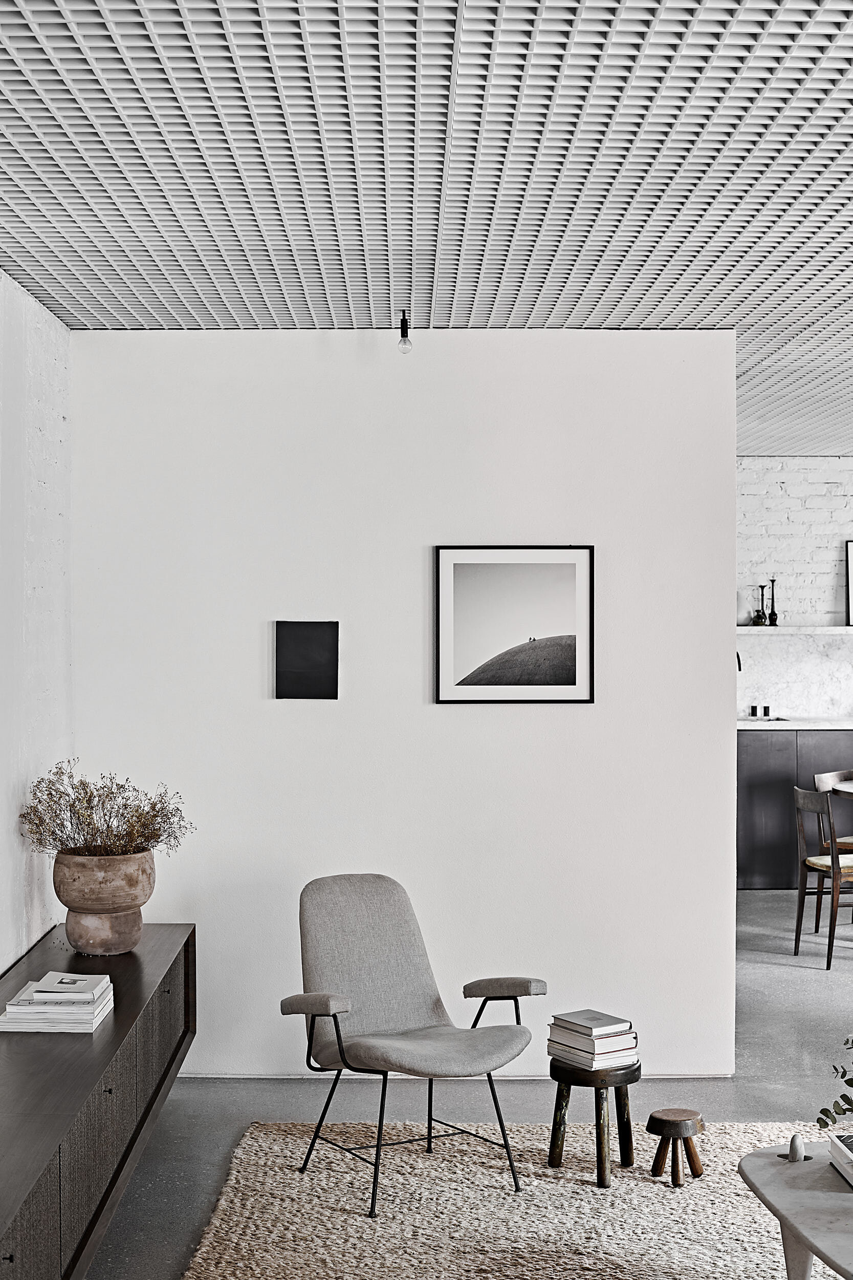
The renewed 130 sqm plan is designed to integrate the living space fully, while clearly defining three different functions: kitchen, living room and home office, whose rhythm is given by a thoughtful sequence of volumes and voids. The only on-suite bedroom and washroom hide behind the end of the brick wall, where another less illuminated corner leads out of the bright salon. Not as neutral as one might think at first sight, the apartment shelters a curated selection of modern Brazilian pieces, such as Zanini ́s and Hauner ́s armchairs, together with international icons, anonymous articles, and a few art pieces.
The white metallic grid ceiling, covering all the apartment’s area, hides air conditioning appliances and lighting fixtures, some of them dropping below in few specific spots.
Further emphasizing the importance of design and architecture as a single, coherent project, Peclat+Chow also designed the white sofa and armchair, the marble coffee table, the kitchen table, and some lighting fixtures, along with all built-in furniture.
All images by Luiza Maraschin


