Hidden Tints from the Beginning of the Last Century in a Stockholm Apartment
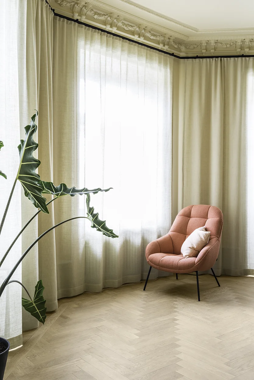
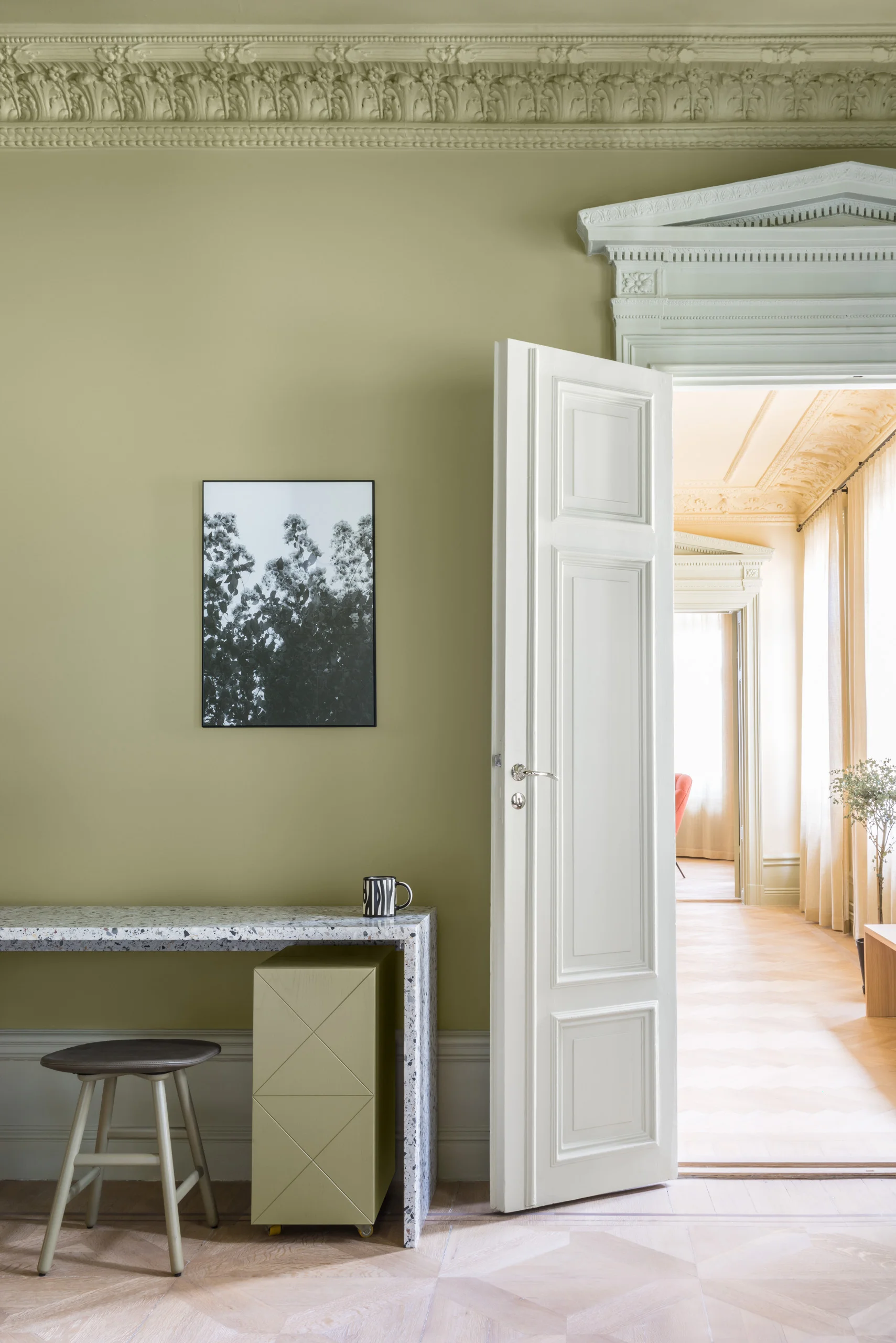
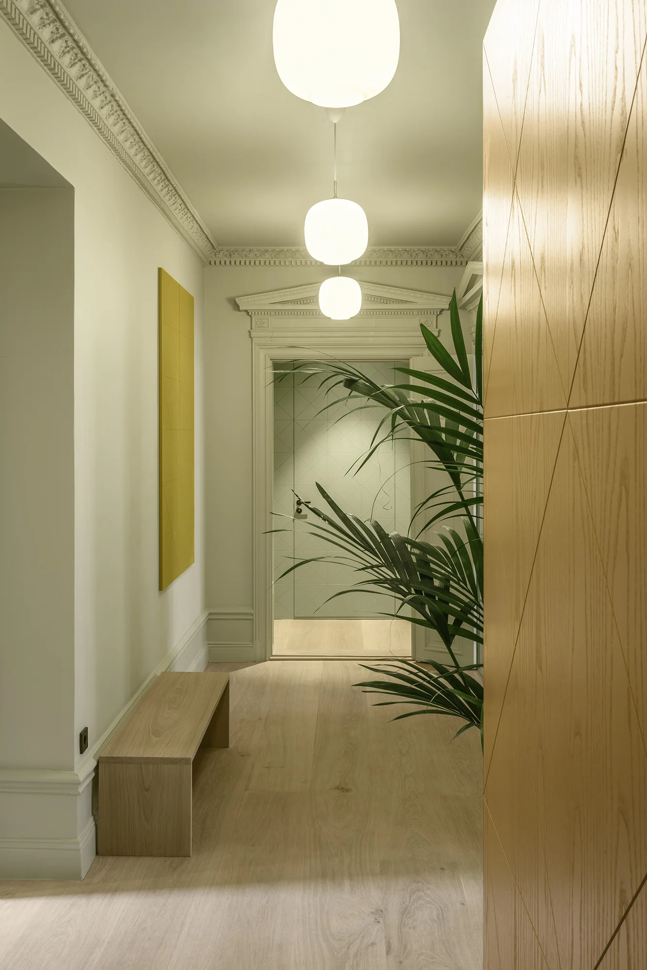
An office space — an apartment without either bathrooms, kitchen or storage — the former head office of a fashion brand in the center of Stockholm and a client that hoped to transform it into a home. Traces of the old 19th century splendour were there — worn wooden floors and ornaments in the form of stucco and carpentry as well as three old tiled ovens — but all those beautiful, old characteristics were painted in thick layers of white color with modern spotlights in all ceilings, which reinforced the feeling of an impersonal office.
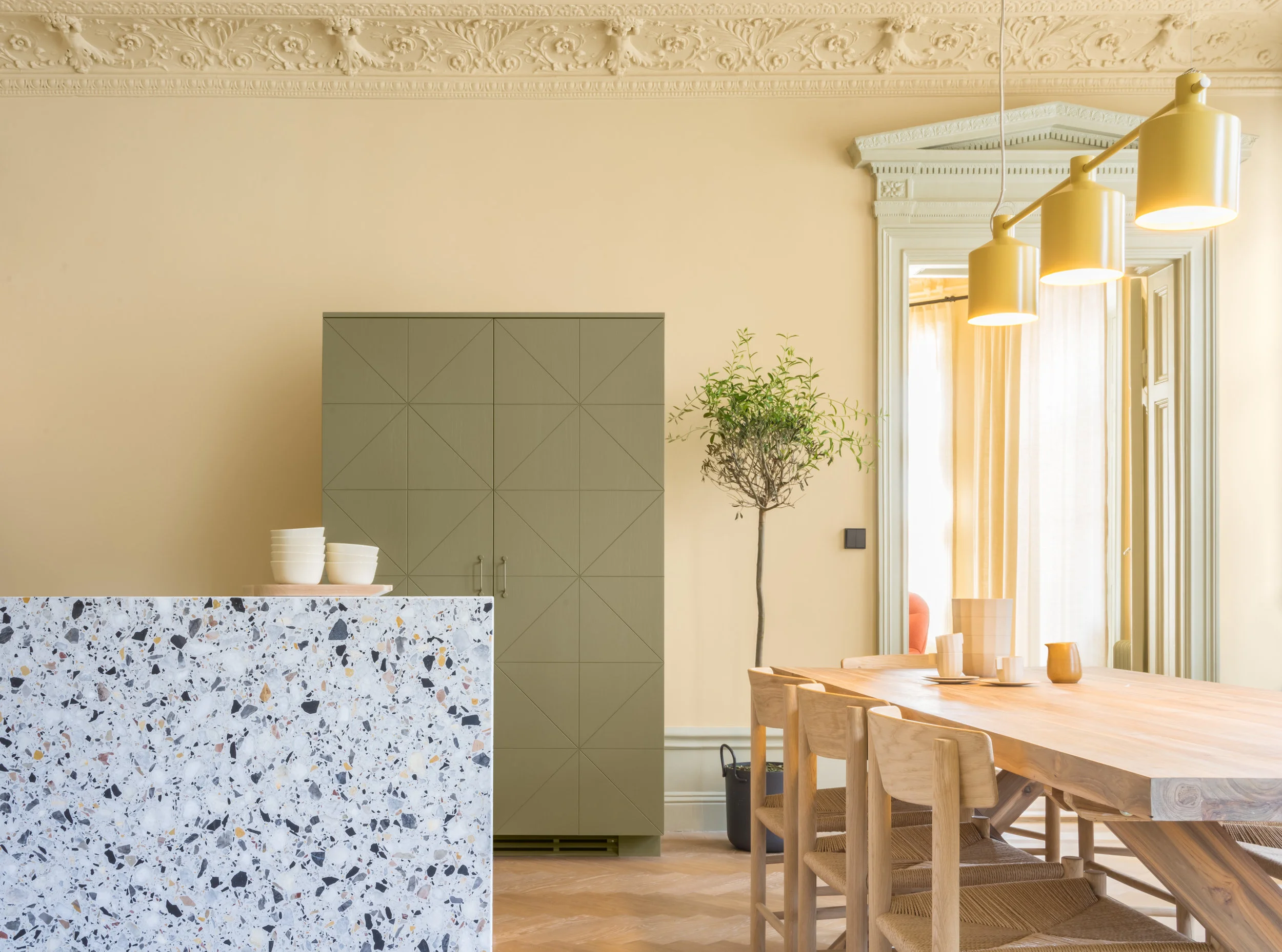
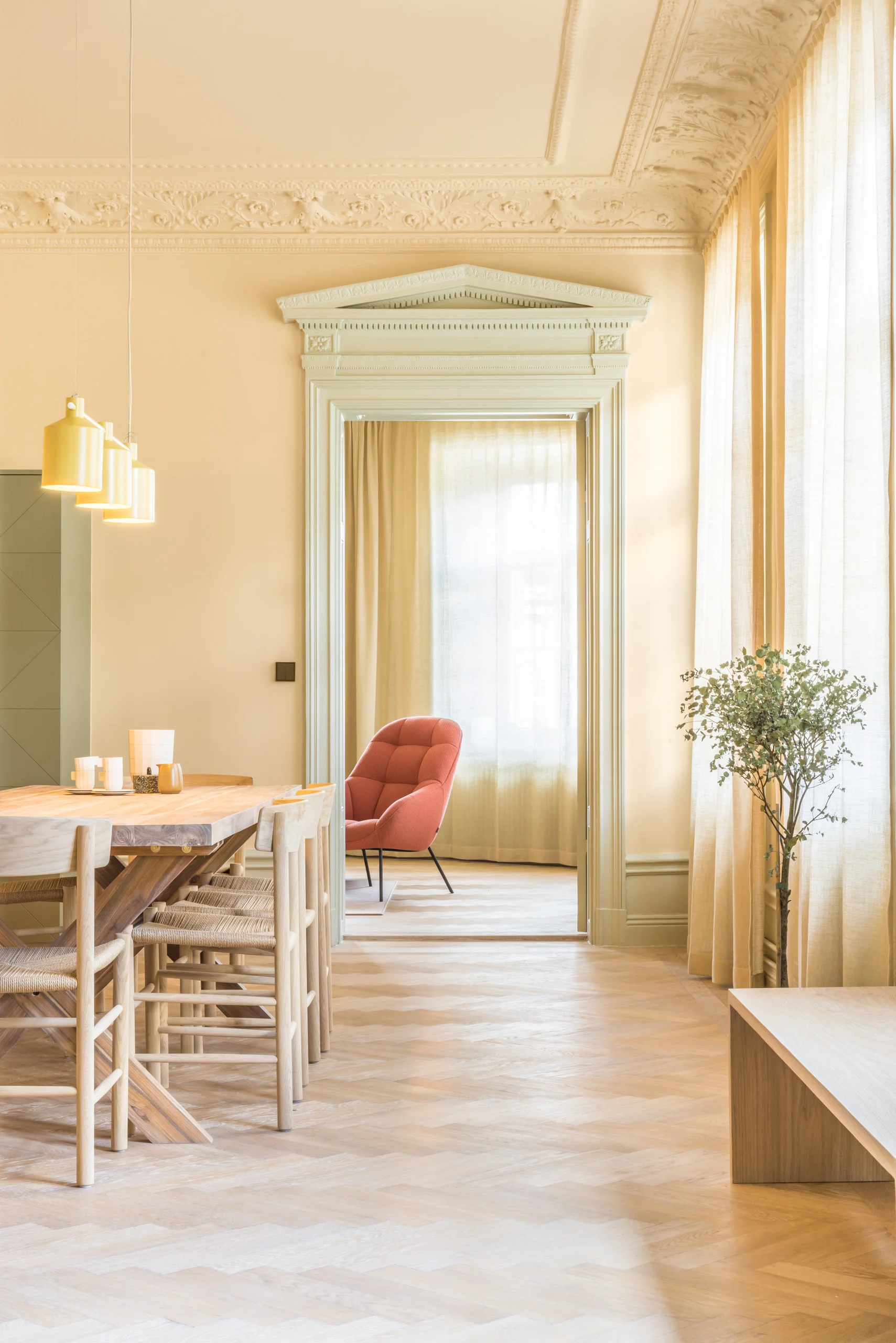
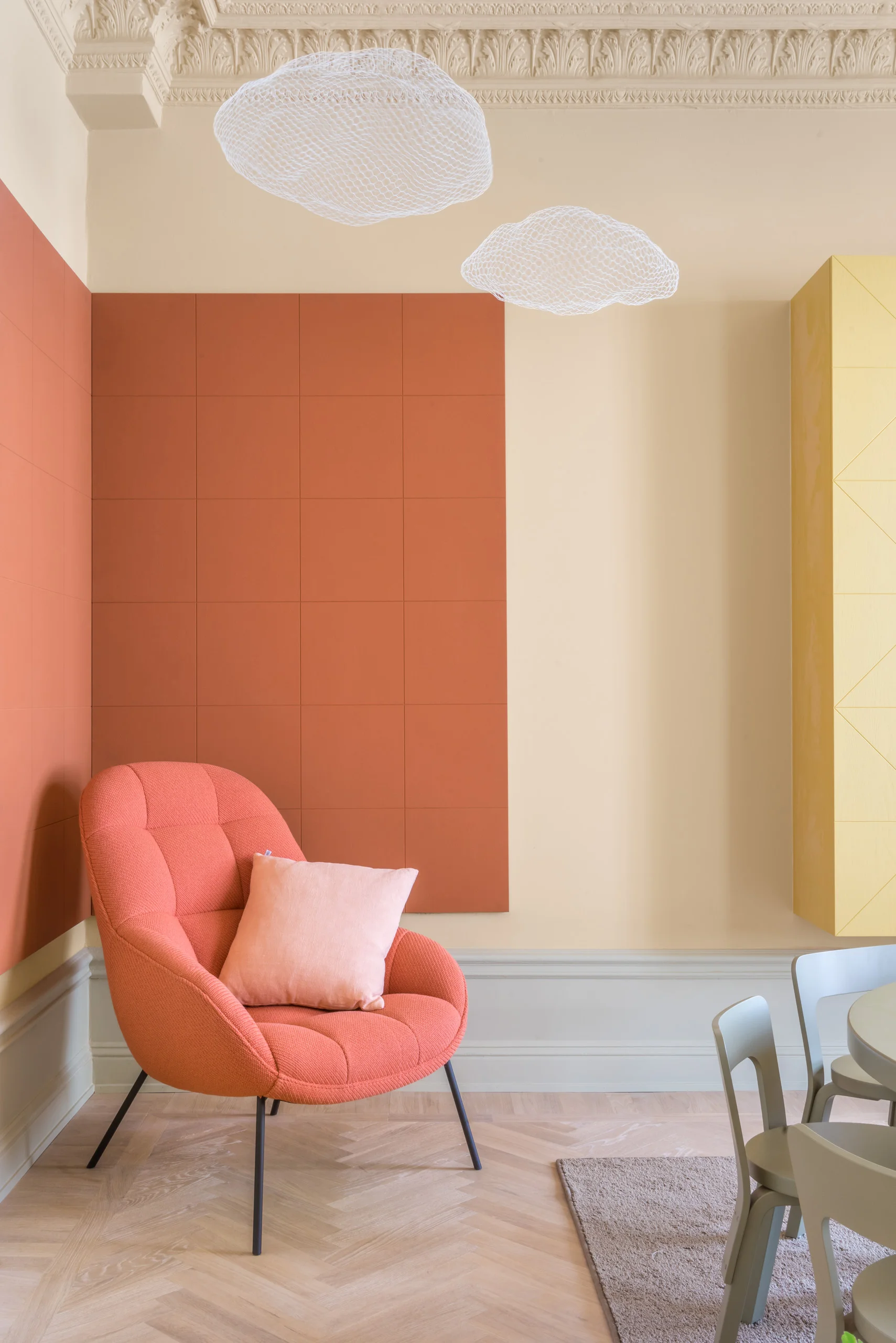
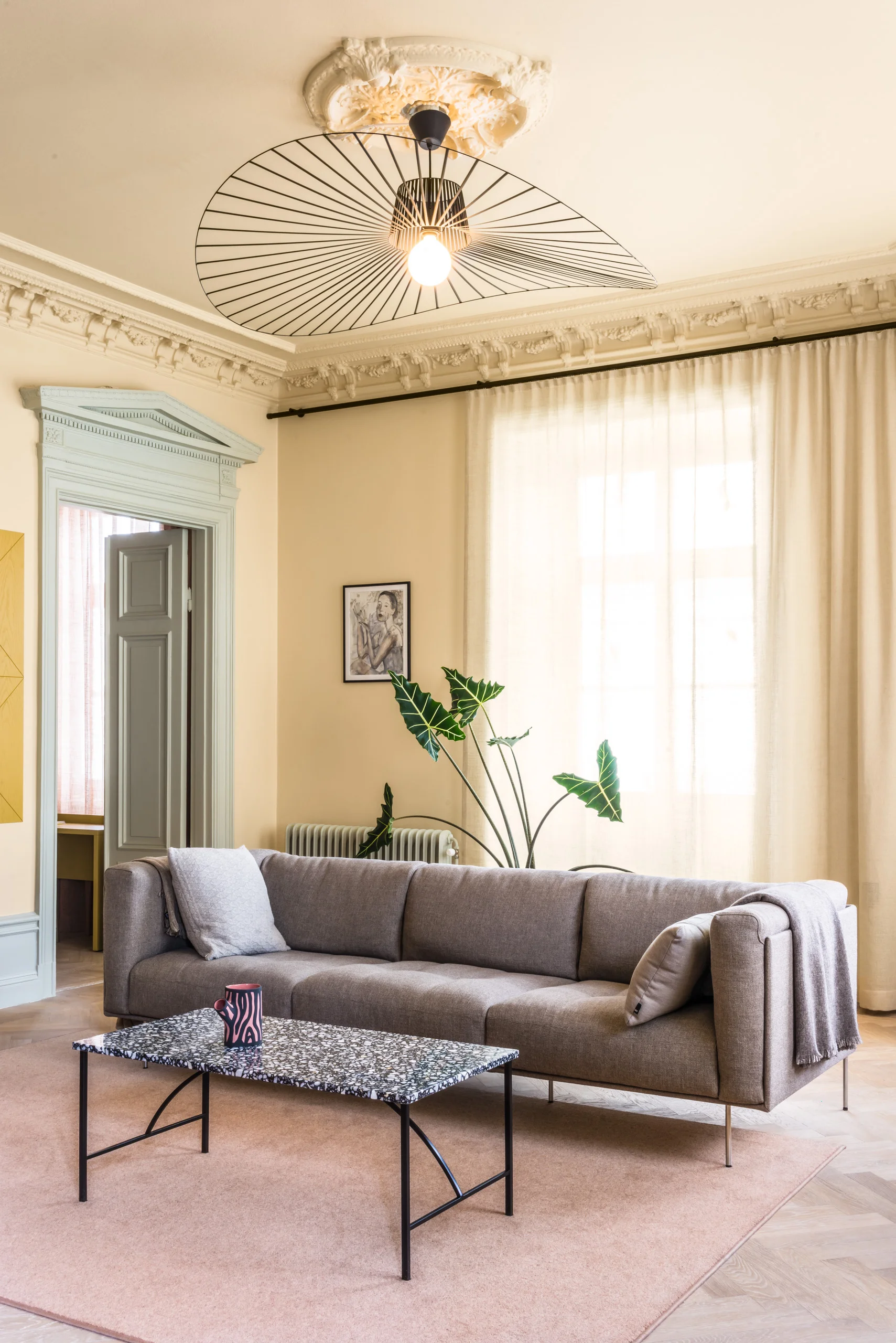
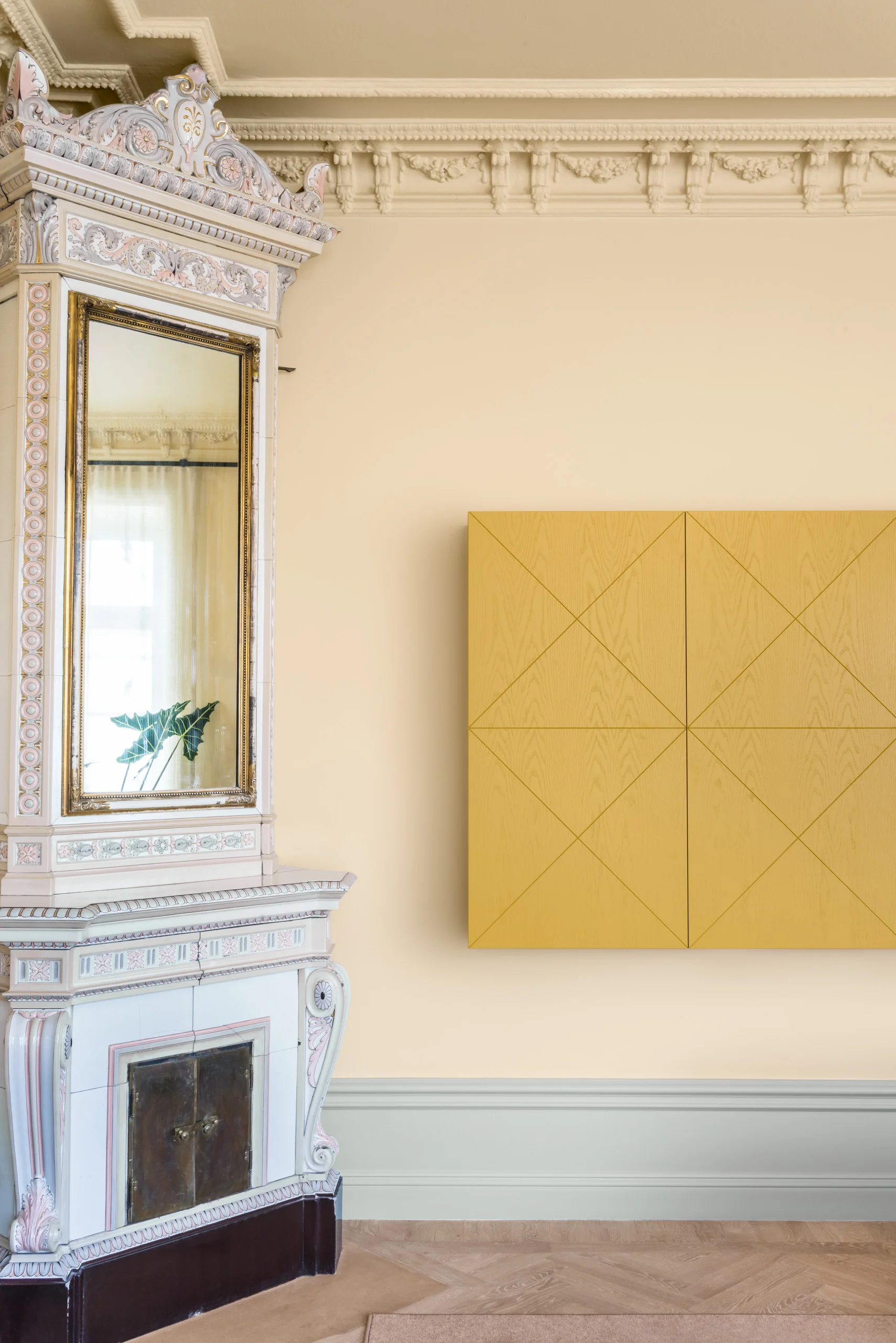
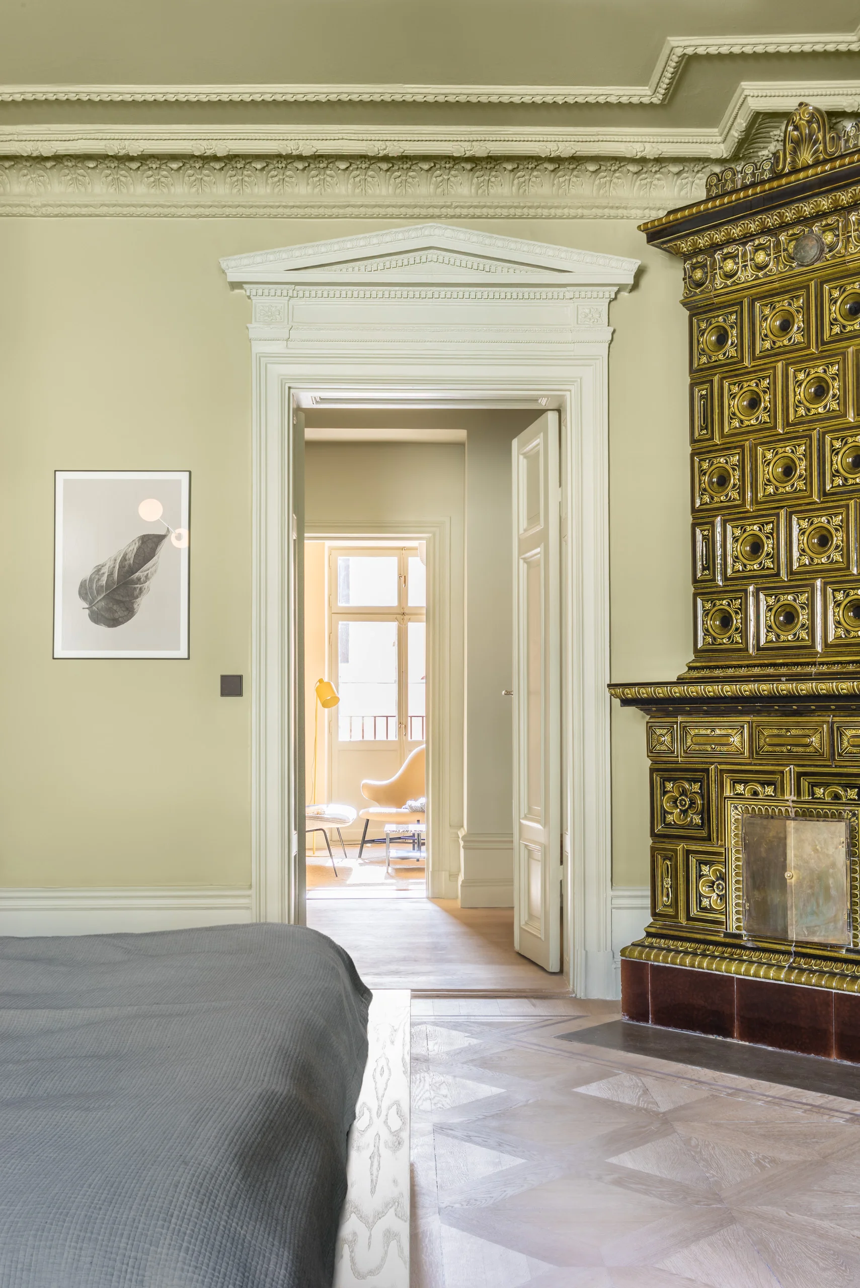
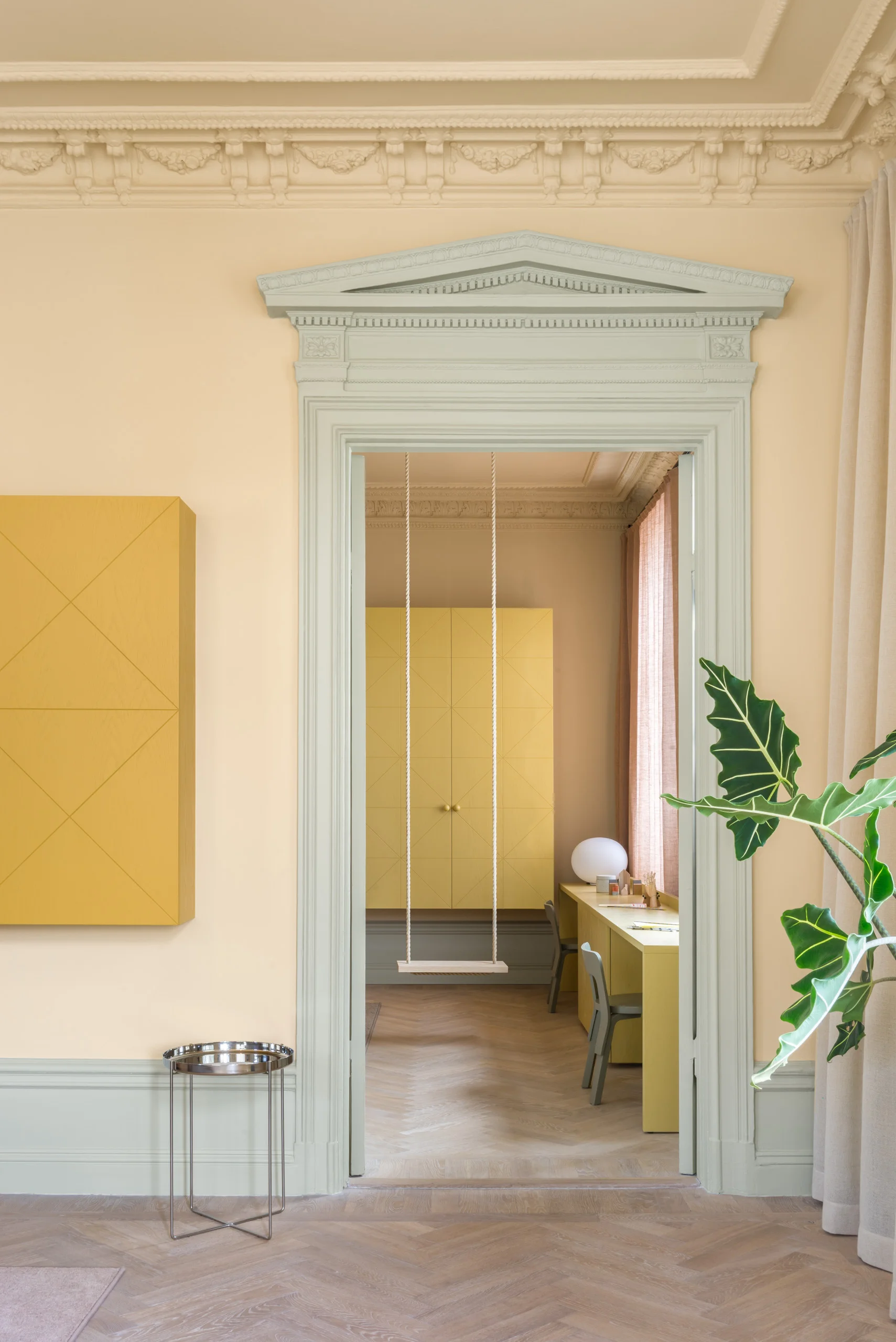
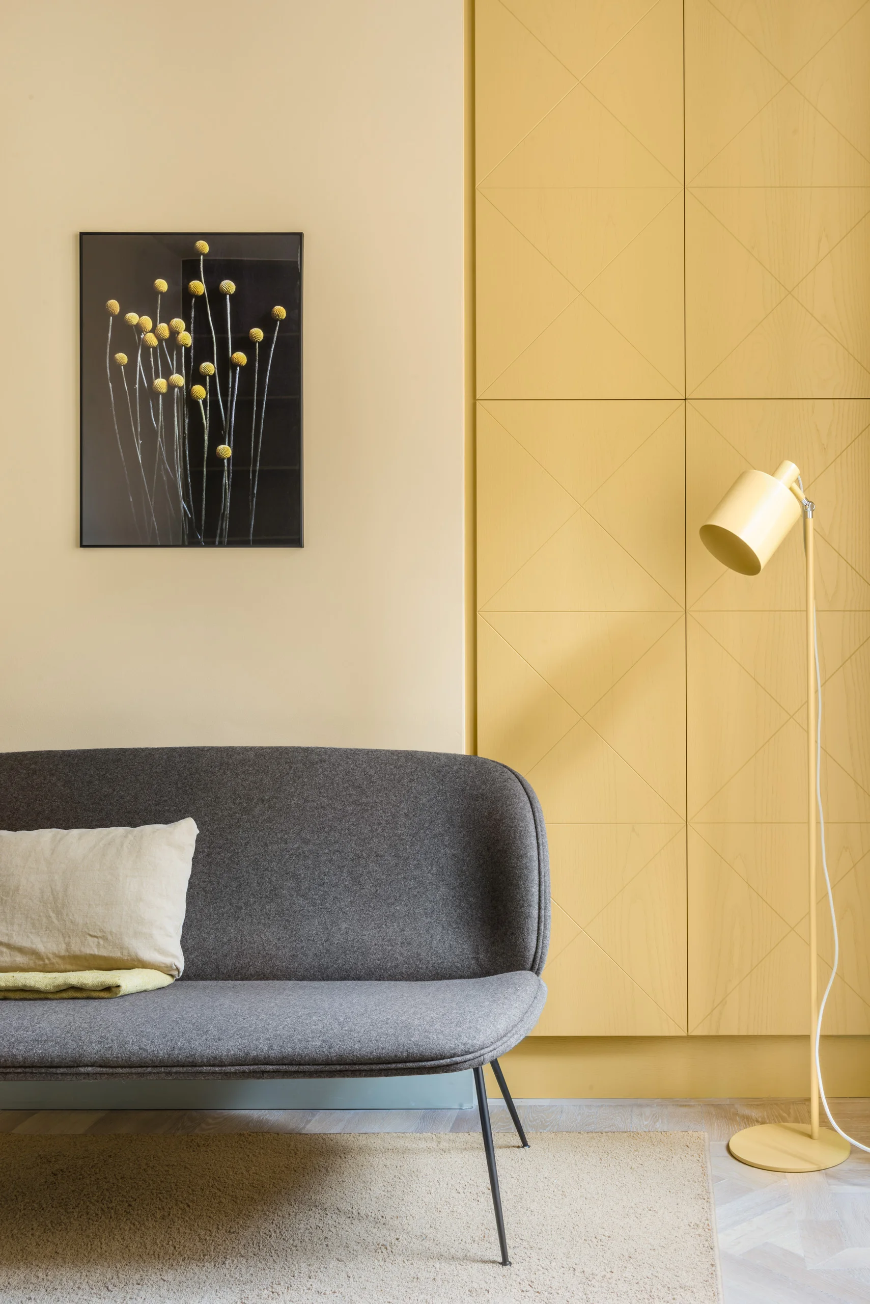
The studio noted the colours of the three tiled ovens; green, pink and a yellowish white. Behind a wall that was torn down to access the old piping, they found original 19th century paint on a door frame, suddenly illuminating the entire white space with its powerful mustard yellow tint. They added tones to the original color scale, which worked as a bridge between the powerful original hues, finally ending up with an 8-tone palette that originated from the hidden traces of the old apartment.
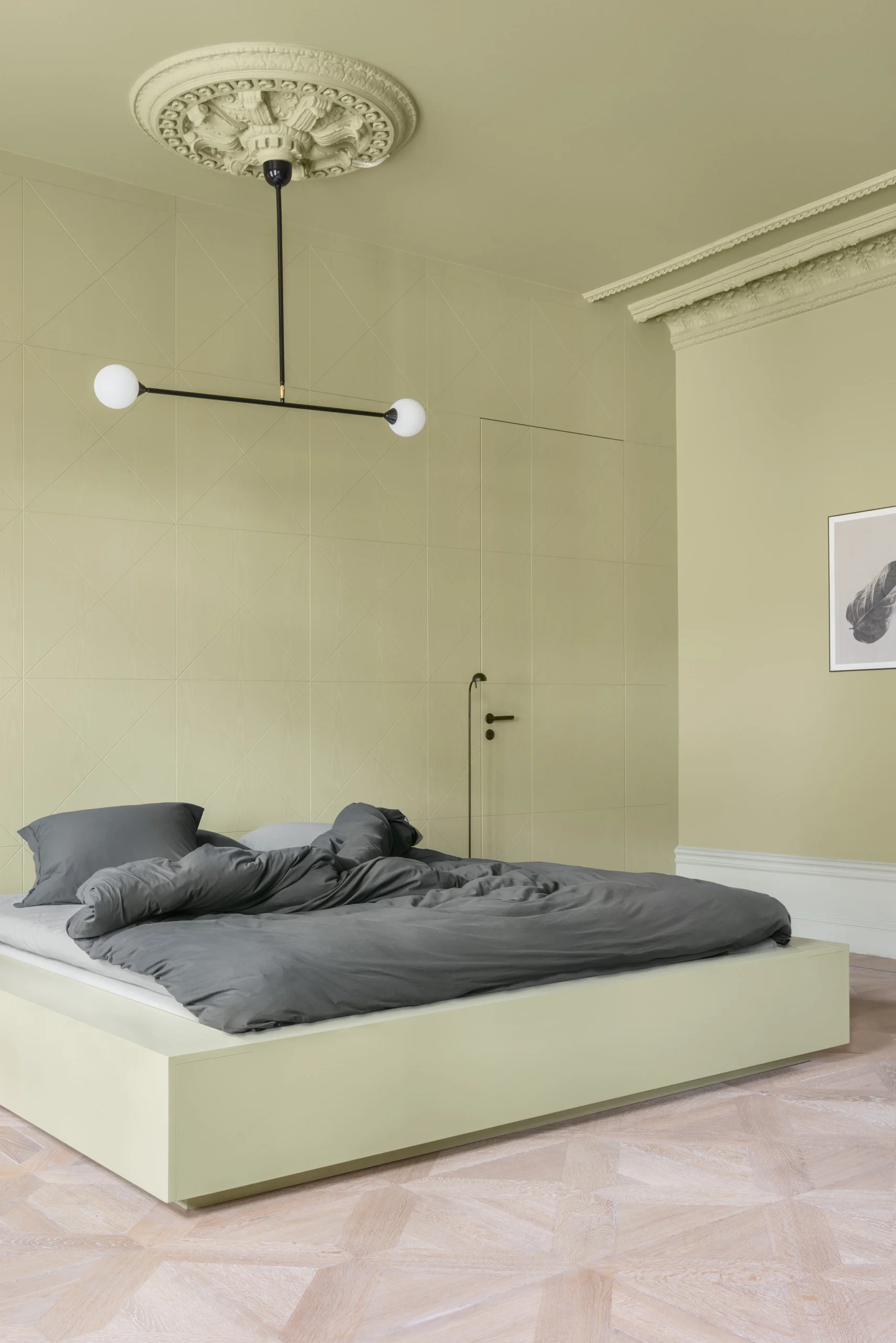
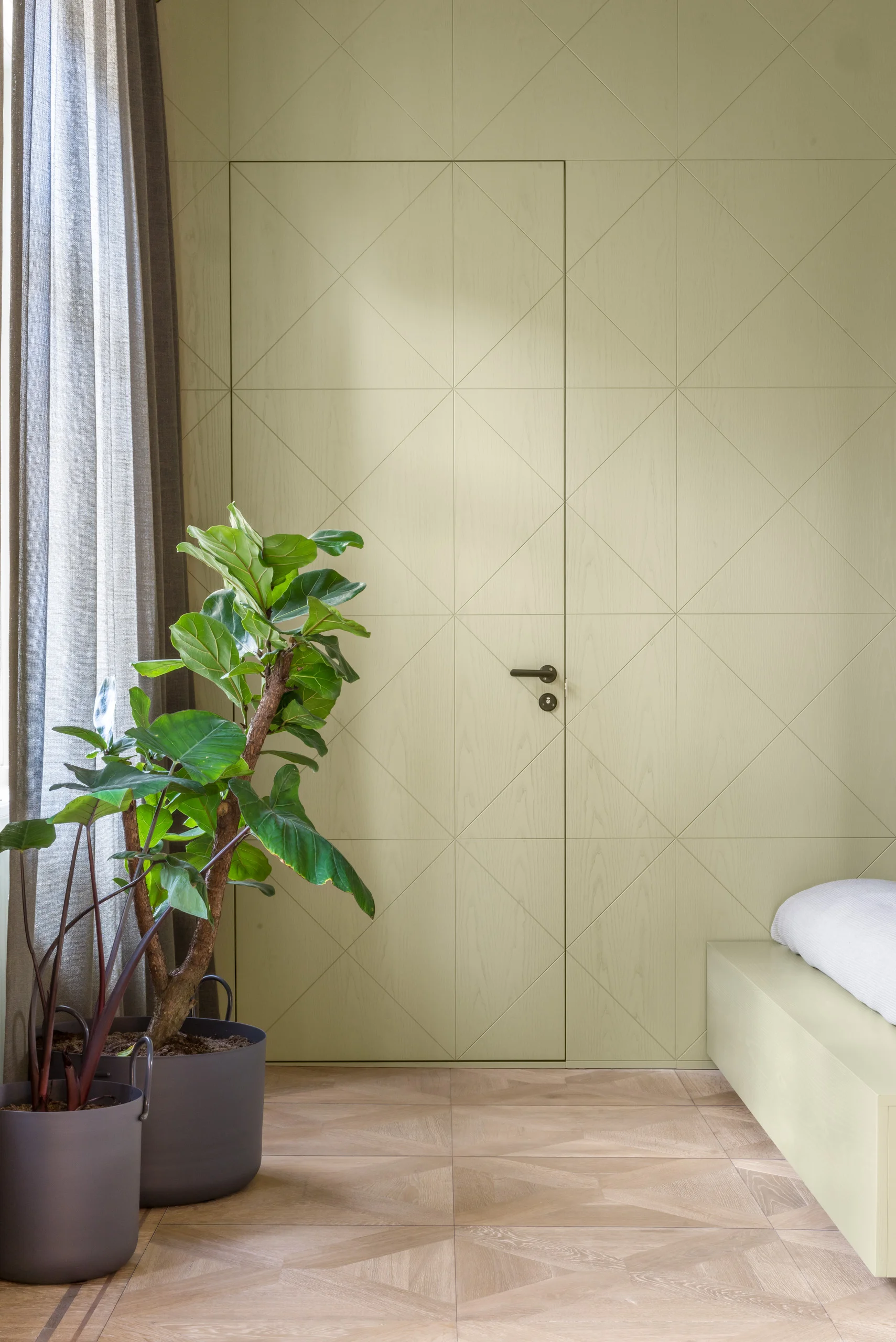
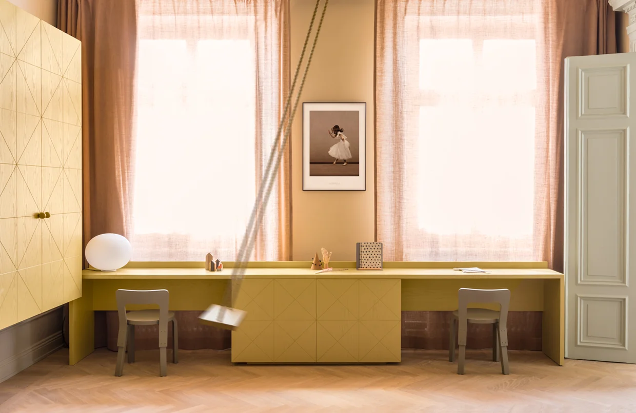
Since they aimed to disturb the original features of the apartment as little as possible, all new elements were placed in the spaces between the old ornaments. All cabinets designed for the apartment hover on the walls between base boards and stucco, or are free-standing on the floors. Two new walls were added and they inherited the same markings as the cabinets — a veneered surface with crossing lines in squares taken from the most beautiful pattern in the apartment; an original parquet in one of the corner rooms.
A color palette based on original colours, three expressive tiled ovens, decorations in ceilings and carpentry and an original pattern from a floor — these old traits and peculiarities were the clues they needed to take a white office space into a contemporary direction. The result is a harmonious but rich color experience – inspired by the original splendour – and a new home for their client and his children.
All images courtesy of Note Design Studio


