A New York City Loft Space Designed for a Female-Founded Hedge Fund Company – Q&A With Interior Designer Christina Loucks
Could you name and describe the area where the space is located?
The office is located in an area of Manhattan called Flatiron situated right off of Madison Square Park.
Could you describe the architectural style of the space and when was it built?
The style was mainly empty with the exception of the construction finishes of the walls, finished wide plank oak floors, commercial lighting, glass office and conference room walls, bathrooms and a kitchenette. The building is pre-war, being built in 1912 and has 12 stories and 9 units.
Who works in this space?
The company residing in the space is a female-founded hedge fund.
What convinced you to work on this project?
A gorgeous, empty NYC loft, a female-founded company, and an opportunity to build out and furnish the space with more of a residential feel and a feminine nod was very enticing.
Could you describe the layout of the space?
The space is one entire floor. It has the founders office, a flexible use space/ desk area for 2, 3 additional offices, a reception area, a traders area, conference room, and kitchen/dining area. The loft office space is roughly 3000 square feet.
What was the biggest challenge you faced to design this space? How long did it take?
This project started the February before Covid hit, that was the main challenge dealing with overseas production for a lot of the pieces, working away from the space, getting Millwork pieces fabricated locally during random shutdowns, furniture arriving with the wrong fabric, millwork arriving incorrectly built. The list goes on. But in the end, it all came out lovely but took beyond a year to complete.
What type of colours did you decide to use in this space and why?
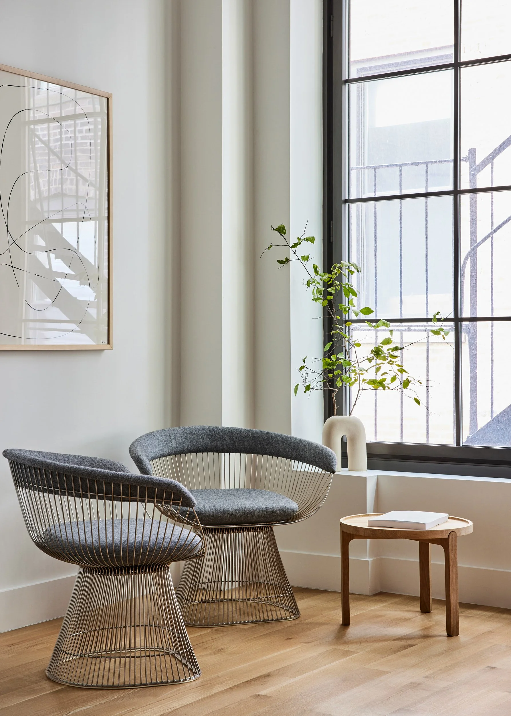
I wanted to stay in natural tones and curved lines as much as possible being that it is a female-founded company. I wanted it to feel naturally feminine but not too clearly that way. There are some fun shapes in the carpet, the sofa, chairs, built-ins, millwork.
What type of materials did you decide to use in this space and why?
We used a lot of natural white oak to help create a seamless flow through the space. I'm very inspired by the Scandinavian / European design where spaces feel so lovely, open and seamless with free-flowing oak pieces. For the upholstery, we used a lot of natural boucles and wool.
What were your sources of inspiration to design and decorate this space?
Soft, wooden palettes and curves.
If you would have to describe this space in one sentence, what would it be?
A warm, inviting rich space with smooth and seamless details that move effortlessly through the space evoking an awareness of detail but not overly residential or professional.
What type of atmosphere did you want to create and how did you achieve it?
The intention was to have a smooth and seamless flow with nods to feminine details and natural elements that ease one moment to the next throughout the space.


